How Artists’ Palettes Have Changed–and How We Have
November 28, 2024

Sneak a peek at the palette of an artist. It will be far more interesting, and revealing, than peering inside their medicine cabinet at a party. In The Artist’s Palette, Alexandra Loske, a British-German art historian, demonstrates the game, describing fifty idiosyncratic selections and arrangements of colors, then showing us the art that was created with them. I love the mess and promise of the paints, the miracles of transformation. An 1840 palette “for painting white satin drapery” lays out browns, Indian red, and ivory black to mix into the white. Degas’ palette blooms with the palest pink, splotches of ecru almost like tulle, then rich blacks and dark teal and Venetian red. You can see a classical ballet emerging.
Study Rembrandt’s moody browns, Artemisia’s glowing russet red, Constable’s thundering blue-gray, Mondrian’s clear red, yellow, and blue. This is a perfect way to see how many different ways there are to paint: methodically, with a precise arrangement of neat color; expressionistically, with smears and smatters of unruly emotion; gently, with polite colors arranged to blend without muddying one another….
The point is to compare the palettes with the paintings, but as I page happily through the book, I think instead about the parallel: how many different ways there are to live a life. That sounds trite, but I sometimes forget the tight relationship between how one lives and what tools one is using to create that life. A privileged few start with a full palette; the rest of us acquire new colors along the way, and when we cannot get exactly the right shade, we find tricks of mixing and placement that will give the same effect. Consequences flow directly from what we choose and how we apply it.
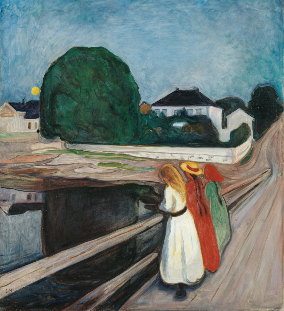
“You have your brush, you have your colors,” Nikos Kazantzakis once wrote. “You paint the paradise, then in you go.”
What am I painting, I wonder. A stormy little Turner landscape dotted with meek sheep, of late. As a young woman, I aimed for a Georgia O’Keefe flower, brazen and delicate at once. In middle age, hunting the courage for candor, I got stuck in Dutch portraits. Each life has changing resonances. Our collective life, though, is more limited, forced as it is to choose which tools will drive culture for millions of people.
The early European and American palettes reproduced in the book are tonally rich, naturalistic, subdued, easy on the eyes. After 1930, the colors turn harsher, brighter, more acidic, as though we have moved from an intimate, candlelit room to a cavernous industrial space with fluorescent overheads. I wince at the brightness; I was maybe meant to live earlier. These tones are ugly to me; they seem unnatural. A gleeful artifice is at work, courtesy of amazing new synthetic pigments. Soon the palettes and subjects are so abstracted from nature, the paintings could have been made just as easily on Mars.
Yet after glaring at that particularly modern greenish yellow for a while, I realize I have seen leaves the same shade, vines of them backlit by sun in a late fall woods. And that bright orange-red? A ball-of-fire sun. The problem is not, after all, the colors. It is their refusal to compromise. Bold and flat, they are laid on a canvas as shapes that could be cut out of paper. In moving forward, art also went back, way back, before the Renaissance, and stripped away perspective. In their vow to experiment, to break things, artists began to prefer abstract shapes to figures.
So much for humanism.
An observant Martian might think we stopped seeing one another’s dimensions, rounded and full, each of us with our own shadows and highlights, our own mood and emotional life. Instead, artists went cerebral and primitive at once, with paintings more like daring art school assignments meant to explore only color or shape.
Decades later, despite a return to representation, portrait subjects often remain flat, painted in ways more decorative or symbolic than realistic. Meanwhile, today’s poppiest pop-culture escapes are animated satire, Marvel superheroes, and graphic novels. Flat and bold, comfortably removed from reality. At least at the surface.
Anyone could contradict any of this. Helen Frankenthaler’s use of color is as evocative as Turner’s pastel sunsets; Lucian Freud’s portraits are even moodier than Rembrandt’s; graphic novels go deeper than you might think. Blurting impressions and playing with their implications, I come at this aslant, having always found modern art exciting but cold. I feel the same about all the technology I have come to depend upon.
But you must admit: this is how we live now. Farther (yes, physically farther, as well as further) from one another. At a remove from nature, buffered from its discomforts and distracted from its quiet beauty. Our built world, our hardscape, is more garish than harmonious. We have come to love our easy plastics and no-care polyesters, our bespoke virtual realities. Tech has given each of us a palette so large, we can barely grasp it, yet so light, we forget to reckon with it. Between AI and our apps, we can create any life we can imagine. But there is so much choice that little coherence emerges.
The delight of glimpsing these artists’ palettes is knowing how, after squeezing out a handful of colors with great deliberation, they could take a small curvy piece of wood in one hand and make a masterpiece. Creativity thrives within parameters. Handed unlimited means of self-expression, we grow dizzy and take refuge in what is familiar or trending. How often, with the whole world’s art, literature, and cinema available to me, have I turned on the latest Netflix hit? Terrified and exhausted by limitless possibility, we conform to the safest bet. But if we lose perspective, there is no chance of depth. Life flattens, and empathy dissolves.
So much for humanism.
Read more by Jeannette Cooperman here.
