How Efficiency Replaced Beauty and Stole Our Souls
October 24, 2021


Above the treetops and pitched roofs of our clean, sweet little town, a giant bobble sits atop stilts. I see it from our window, and I would not blame beer-soaked teenagers if they climbed up (careful, though!) to adorn the thing with graffiti. Anything would be an improvement.
Now Waterloo (its name rendered a pun by my musings) plans to install a new water tower. What on earth will we do with this one? Condos for the apocalypse?
And will the new one be as ugly?
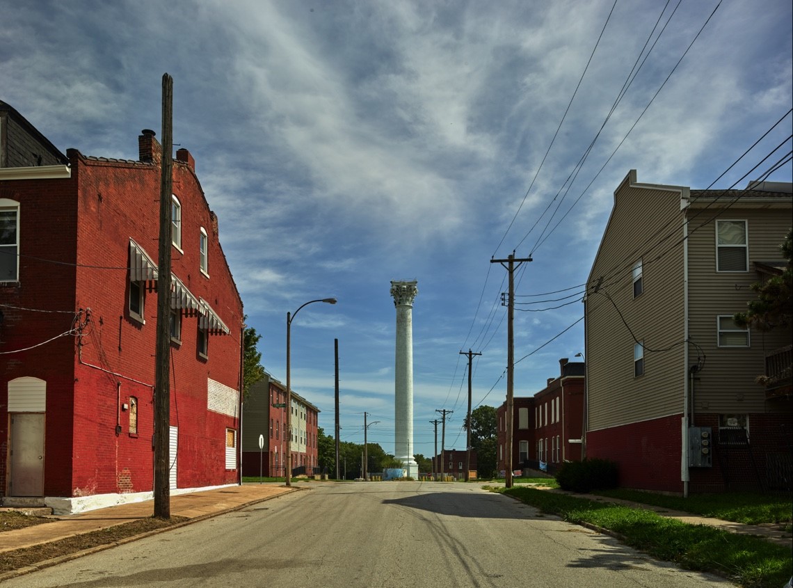
The Grand Avenue Water Tower, shown above, caught the imagination of fine art photographer Michael Eastman. The oldest water tower in St. Louis, it stands proud at Grand and North Twentieth, surrounded by dilapidated but solid redbrick buildings, vacant houses, curbside shrines where children died, and to the west, a convent of contemplative nuns. Rising above all the attempts at urban renewal, all the crime, all the prayer, this is the tallest free-standing Corinthian column in the world. At 154 feet, it is more than twice the height of Pompey’s Pillar in Alexandria, almost three times as tall as the Olympieion in Athens. Built in 1871, the Grand Avenue tower was designed to house a standpipe five feet in diameter and a spiral staircase that rose to the capital. Renovated a quarter-century ago, its white paint needs refreshing, but that is no more than a powder puff to a shiny forehead. Just looking at the tower settles my soul.
Europe’s nineteenth-century water towers are also works of art, tiered and balconied, ornate and graceful, sometimes redbrick covered with ivy, sometimes soft shades of gold and green and terra cotta. Some of these water towers are still in use; others are tourist attractions. The comments from wondrous American tourists are revealing: “Water tower Jungfernheide turned out to be so beautiful I could hardly recognize its practical usage.” And at Wasserturm Gaswerk Mariendorf: “The tower resembles a fairy tale castle, and a cute balcony adorns its front side. So much work just to make it look not ugly!”
We have been persuaded that ugly is more efficient. And why? Because it is cheaper. In this raw and hungry young country, we allowed our technology to outstrip aesthetics. Integrating the two would cost more, require tedious effort, take valuable time—and why would capitalists bother?
We did retain a sense of humor at first, building a giant catsup bottle; a giant peach; a riveted Oz-ian witch’s hat for the Warner Bros. studio. Stanton, Iowa, erected a giant coffee pot to honor a hometown gal who starred as Mrs. Olson in the Folger’s commercials; Randolph Air Force Base built itself a Taj Mahal. But once we figured out how to weld, most towns opted for the bubble, either on stilts or growing from a center stem.
When I wrote for a city magazine, a friend suggested a standing column called “Why So Ugly?” We could have filled it for years. St. Louis had some extraordinary architecture in its day, crafted with painstaking and exquisite detail. Much of it has been torn down because—say it with me—“It’d cost more to restore it than to build new.” Our houses are templated, our highways lined with crass billboards, our main arteries clogged with strip malls. Is it truly impossible, when tourists fly into space, to design an elegant strip mall? Talent and quality building materials are expensive, but there are plenty of idealistic architects eager to create with new materials. Developers ignore them and heed only the bottom line. But what use is that profit margin if, by shopping in a row of stores that looks like a plastic pill minder, we numb our souls?
When László Moholy-Nagy broke new ground for modern art, his push was to adapt to the future. Mine would be picking up all the past beauty we have discarded. Gargoyles and ornate friezes. Medieval cloister walks, ideally of vine-cooled stone, in parks, so you could comfortably take at least a short walk in rain or sleet or snow. Glass-block windows with deep ledges inside showers, giving you natural light and an easy place to set your shampoo or razor. Pigeonholes and secret compartments in roll-top desks. Four-poster beds with gauzy curtains. Remember when banks and courthouses were magnificent edifices lined in marble and movie theaters were gilded palaces? Now they are all drywalled boxes with cheap carpet and bad light.
So much that made life gracious, we cast aside. Look at our technology: lumpish gray laser printers; glass rectangle phones that do not conform to the human ear; hinged laptops that strain our necks; automobiles that look like armored tanks rather than those sleek and sexy finned Midcentury marvels. Customers of the middle-class demand no better; we have been trained to accept practical necessity and leave beauty to the rich.
Why bother to reclaim it? Because it makes us feel better and helps us be better. “Ugliness brings revulsion, aggression, hate, and even anger,” Sigurd Olson wrote, “while beauty always gives joy and a sense of fulfillment.”
Maybe he was wrong. Maybe money brings more satisfaction, and we do have to choose. Maybe our surroundings do not need to please our eyes or calm our spirit; that is just fanciful waste for suited for Versailles. The thought sinks me low. I have been so sure that our minds and bodies crave beauty. Glum, I toss my notes to the back of the desk.
And then I read about the work of Semir Zeki, chair of neuroaesthetics at University College in London. He showed people beautiful paintings—along with other, less beautiful paintings for comparison—and measured blood flow to the prefrontal cortex. The blood pulsed into the front of the brain when people beheld beauty (which turns out to be a fairly universal assessment). “Art changes the physiology of our brains,” Zeki reported, “and contemplation, observing, and taking in beauty all stimulate the pleasure centers within the brain.”
Maybe that is the argument to make. Beauty sounds frivolous, but stimulating the pleasure centers just might be sexy enough to inspire developers and designers. And, please, water-tower engineers.
Read more by Jeannette Cooperman here.


