Do I Hate the Modern or Just What It Fails to Represent?
March 27, 2025

Finally, I was honest. Forty years of trying not to be, and all it took was a glass of wine and friends I hoped would understand.
They were asking what I thought of the new building fondly known as The Cheese Grater, aka The Pineapple. Our host had written a warm letter of gratitude to the architect, because TCG is visible from her balcony and its silvery-bluish-green turns different colors at sunrise, creating a subtly wonderful spectacle to start her day. Another guest had been inside and was underwhelmed, but he judged the exterior superb.
“What do you think of it?” he asked, turning to me.
“Oh, you don’t want to ask me,” I blurted. “I like Palladian.”
He blinked.
“Symmetry?” someone else asked.
“And columns, and arched windows,” I replied. “Just enough curves and straights, not plain cold boxes or deliberately weird geometries.” There. It was out. And no one had fled screaming from the room.
All these years, I tried. I really did. But after my intense love of the Prairie School, hardly anything felt as serious and transcendent as the old classical and neoclassical styles. To be so reactionary embarrasses me. I worked awhile at an architectural firm, early on, and the profession continues to fascinate me. Today’s tech allows more curves, at least, and the use of light is more skillful every year—soon it will rival Chartres. But ornament is still vilified, as are the classical shapes and balanced symmetries that harmonized so perfectly with what our brain craves.
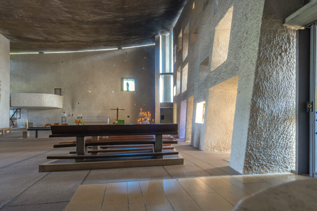
Venturi, Graves, and Philip Johnson “quoted” classical forms, but as garnish, the way the literati drop Dorothy Parker into their cocktail conversations. Richard Meier did better, capturing both purity and grace. Kengo Kuma seems to get it. And Le Corbusier almost changed my mind altogether with Notre-Dame du Haut.
Not to be confused with Paris’s legendary Notre-Dame Cathedral, the chapel is a simple white building high on a hill in eastern France, looking across at the Jura Mountains along the Swiss border.
Le Corbusier knew the site’s history: the ancient Romans and sun worshippers who climbed this hill; the fourth-century Christian chapel; the medieval cult of the Virgin; the pilgrimage chapel that was razed in the horrors of World War II. He saved the rubble and used it to fill the interior of the new chapel’s south wall, so that history would always be present.
What helped create this masterpiece was its first obstacle. Hilltop access made it too difficult to use the mechanical technology possible in 1954, so construction would be, of necessity, slower, more organic, and more painstaking. The challenge suited Le Corbusier: his design was sculptural rather than boxy.
The chapel has two entrances, a main altar, and three towers. Columns stand inside the thick walls, and the curved roof sits gently atop them, billowing like a sail. The floor follows the curve of the hill, sloping downward toward the altar.
Le Corbusier worked on the south wall for months. As it moves from east to west, curving toward the south, it takes on more weight, until it is ten feet thick. Deep clerestory windows are set in the wall, the glass at different depths and the openings slanting at different degrees, so the sunlight enters at different angles. Though their positions look like a haphazard scatter, the architect used the Golden Ratio to place them. The glass glows red, amber, or green, and above the south wall, the roof floats, supported only by the columns, so a horizontal strip of sunlight also enters the chapel. When it rains, the drops sluice off the sloped roof in a waterfall, landing on abstract, slanted structures to create a fountain.
Imagining myself in this place, hearing that soft rush of water, then seeing the ruby and emerald glow of the returning sunlight through those windows, it occurs to me that my underlying problem is not with the bland, boxy, or Brutalist forms I rail against. I hate them, but they are not to blame. The problem lies not with the forms but with their content, their inspiration—or lack thereof. Classical and neoclassical buildings were designed in a time of reverence. Banks and brokerages were temples of marble and mahogany because money was still solid and relatively static, not electricity zapped around the world at light speed and changing value just as fast. Companies symbolized hopeful prosperity rather than corporate greed. Universities honored the pursuit of knowledge rather than its politics and price tag. Estates were nods to wealth and tradition that traced back at least a century, not ridiculous new money made by the latest Masters of the Universe. The first movie theaters and department stores were palaces thrilled by their own content.
When contemporary architects design a museum or opera house, or create a sustainable building that makes room for nature, the old reverence glows through. But there is little that is inspired in the architecture of corporate towers, fancy condos, and big-box stores, and the compromises made to keep costs down further hinder the vision. Construction feels temporary for good reason: we are looking at structures that will crumble before we do. Meanwhile, the stars who are awarded commissions with few constraints feel obliged to make a splash, jolting rather than soothing and delighting us.
To create beauty, you have to still believe it matters more than money—and what it represents matters more than you do.
Read more by Jeannette Cooperman here.


